a study in color

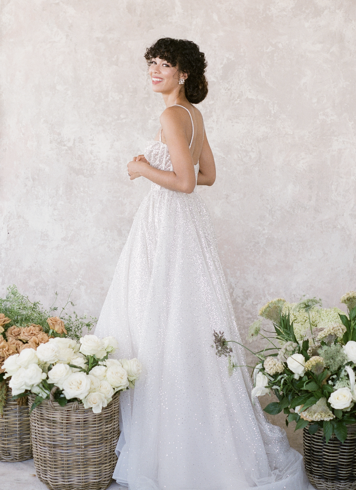
It’s rare we have the opportunity to do a styled shoot for fun, but sometimes creating, just for the sake of creating is good for soul! I had the pleasure of collaborating with The Komans, an incredible photography team in Los Angeles where I designed a shoot around unique color combinations that I’ve often times avoided in the past. It was a study in approaching a “challenging” scenario and turning it into something that became the best part of the finished product ultimately. In this case, I chose to embrace a color, I’ve long avoided: orange! To me, orange was something better left to Hermes or not at all. The approach to this was to utilize shades of orange I found less “offensive” and create a very earthy design with a color palette of muted greens, rusty oranges, soft peaches and white. This combination softened the overall orange tone, and provided a sense of balance and ease to the overall design. This practice is something I apply to my designs when working with clients that have bold color palettes. Finding balance and harmony with those bold colors allows them to make a great statement, without being overwhelming to the eye!
Photography by The Komans | Rentals from Catalog Atelier | Paper goods by Paper Birch Designs | Hair & Makeup by Kohnur